I'm currently finishing off the Literature & Latte website: getting the new forum up and running, gathering together free downloadable stuff (a couple of trivial programs and some classes for Cocoa programmers), putting together a links page, and of course getting the Scrivener page ready (so that I'm ready to hit the ground running when it is actually finished). Whilst I've been doing this, I've also been mocking up the new interface for Scrivener. I had it sketched out on paper, but I wanted to see what it would look like in practice: there's no point in forging ahead unless it looks like it's going to work. (Pretty much all of the code for Scrivener has already been written - the hard part now is just putting it all back together so that it works well in the new interface, optimising it and ironing out any glaring bugs - a couple of months' work at least.)
This is really the third iteration of Scrivener's interface; the fourth, if you count Hemingway, my prototype for Scrivener. Getting the interface right has probably been the single-most difficult aspect of designing Scrivener - after all, a good interface is crucial, and can make or break an application. These have been my objectives in designing the interface:
- It has to be intuitive. If you need to glance at a manual before you start writing, something is wrong.
- It has to allow fluid movement between outlining, composing and editing.
- Every document should be linked with a synopsis, to facilitate easy outlining.
- You should be able to get everything out of the way if you want to so that you are left with just you and your text.
- It should provide for easy cross-referencing, both with other text documents and media files used for research.
- You should be able to dictate the way you want to work (I hate software that tries to force you into a particular work flow), so it has to be flexible.
- There should be no bloat. If it's not essential to everyday writing, it doesn't belong in the application.
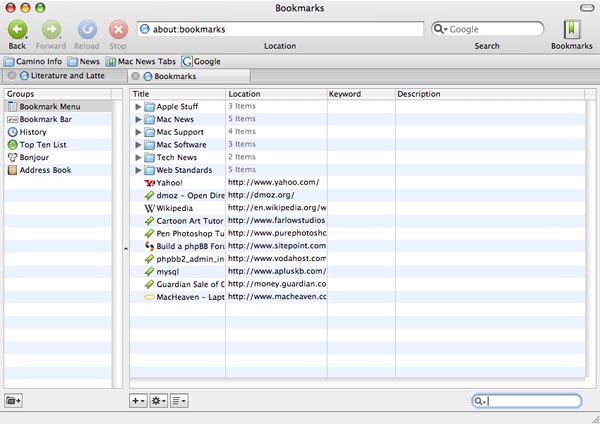
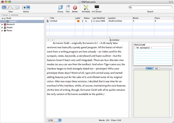
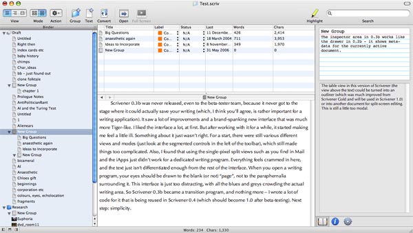
The hardest part of designing a really good, intuitive interface has been simply this: there are currently no programs out there quite like Scrivener to refer to for inspiration. Now of course, I'm not claiming that there is nothing else out there that has the same purpose as Scrivener (there is plenty); just that nothing else quite works in the same way. For a start, no other program I know allows you to keep a synopsis for each document that can be viewed in a separate overview as an outline (which was Scrivener's original raison d'etre). And, whilst there are a few index card/corkboard emulations out there, all of the programs that do provide a corkboard provide it as their main feature, not as something integrated with project management, text editing or outlining (excepting perhaps Final Draft). This gives rise to numerous implementation problems: exactly when should you see the corkboard? How should you be able to access it? In Scrivener Gold, the corkboard is a separate mode altogether. It's like another program tacked on, which is not good. In the never-released Scrivener 0.3, you would see the corkboard when you clicked on a group in the binder - but this was problematic too, because groups could also hold text, so you needed a switch to toggle between viewing the corkboard and the text for group items. Hardly elegant. Now I have come up with another solution: the corkboard (and outliner mode, for that matter) works a little like "Bookmarks" in Camino. Click the corkboard in the toolbar and the current document turns into a corkboard, displaying the children of the currently selected document (outlining will be a little more fluid in the new version - like groups, text items in the binder can also have children, for instance). Click it again, and the corkboard disappears.
And what about all the problems involved in having a split view that lets you look at your research in one view whilst looking at your text in another? To my knowledge, no other program has that feature (yet). I would be surprised if I'm not wrong, though - there must be. It's such an obvious idea. I looked to DevonThink for ideas, but as good as DevonThink is for storing lots of different document types, it only lets you look at one at a time in any one window.
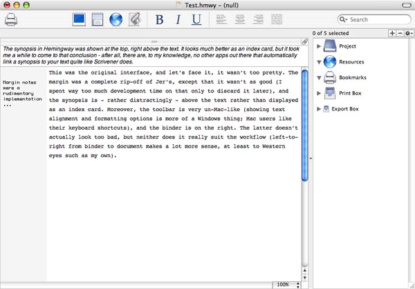
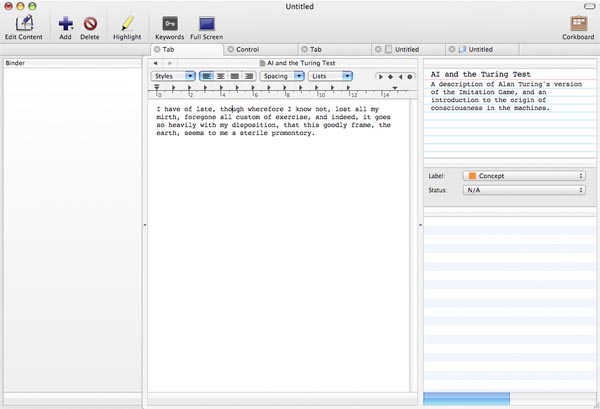
Hence the many revisions and iterations of the Scrivener interface. I've finally hit on one I think really draws everything together in a unified, intuitive manner, though. So before I present you with a mock-up of the new interface, humour me whilst I blather a little about some of the other interfaces that nearly made the grade.
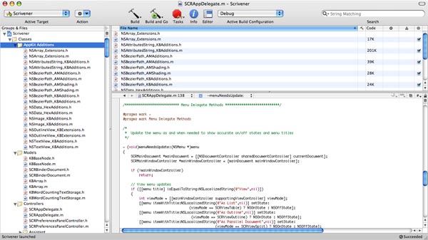
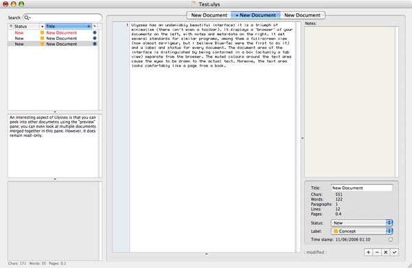
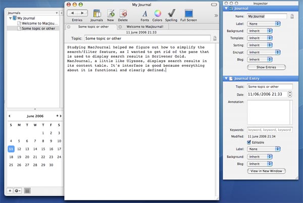
Firstly, I should acknowledge some of the main influences on the Scrivener interface. The biggest influence at first, I think it's fair to say, was Xcode (which I believe also had an influence on various other apps out there, such as DevonThink):


0 Comments
Please sign in or register to comment on this post.
Register
Sign in
Forgotten password