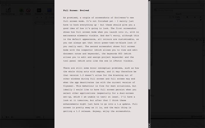
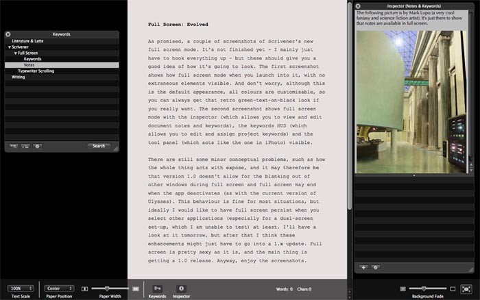
As promised, a couple of screenshots of Scrivener's new full screen mode. It's not finished yet - I mainly just have to hook everything up - but these should give you a good idea of how it's going to look. The first screenshot shows how full screen mode when you launch into it, with no extraneous elements visible. And don't worry, although this is the default appearance, all colours are customisable, so you can always get that retro green-text-on-black look if you really want. The second screenshot shows full screen mode with the inspector (which allows you to view and edit document notes and keywords), the keywords HUD (which allows you to edit and assign project keywords) and the tool panel (which acts like the one in iPhoto) visible.
There are still some minor conceptual problems, such as how the whole thing acts with expose, and it may therefore be that version 1.0 doesn't allow for the blanking out of other windows during full screen and full screen may end when the app deactivates (as with the current version of Ulysses). This behaviour is fine for most situations, but ideally I would like to have full screen persist when you select other applications (especially for a dual-screen set-up, which I am unable to test) at least. I'll have a look at it tomorrow, but after that I think these enhancements might just have to go into a 1.x update. Full screen is pretty sexy as it is, and the main thing is getting a 1.0 release. Anyway, enjoy the screenshots.


0 Comments
Please sign in or register to comment on this post.
Register
Sign in
Forgotten password