When we first started putting together The Big List of what Scrivener 3.0 was going to be about, high upon it was the nebulous goal of making the overall experience more cohesive and streamlined. We may spend a little time going over some of the many finer points of that project in a future article, but for now I wish to focus on one aspect of that, something that some might consider to be a smaller adjustment, but one that has changed how I organise work inside of my projects—and reintroduced me to a feature that I had let languish in my own daily use of Scrivener.
If you’ve never come across Project Notes before, they are akin to a basic scratch pad for your project; a place that is always within arm’s reach, no matter what you’re working on at the time. You could either open them up in a separate window, or switch to the “notes” tab in the inspector and keep them right alongside your work.
It’s a great idea[1], but it had a few drawbacks: they didn’t come up in searches along with your other notes and written material, you couldn’t link to them like you could other files in the binder, nor could you include them in the compiled output for proofing drafts, copy them from one project to another—or even export them at all for that matter.
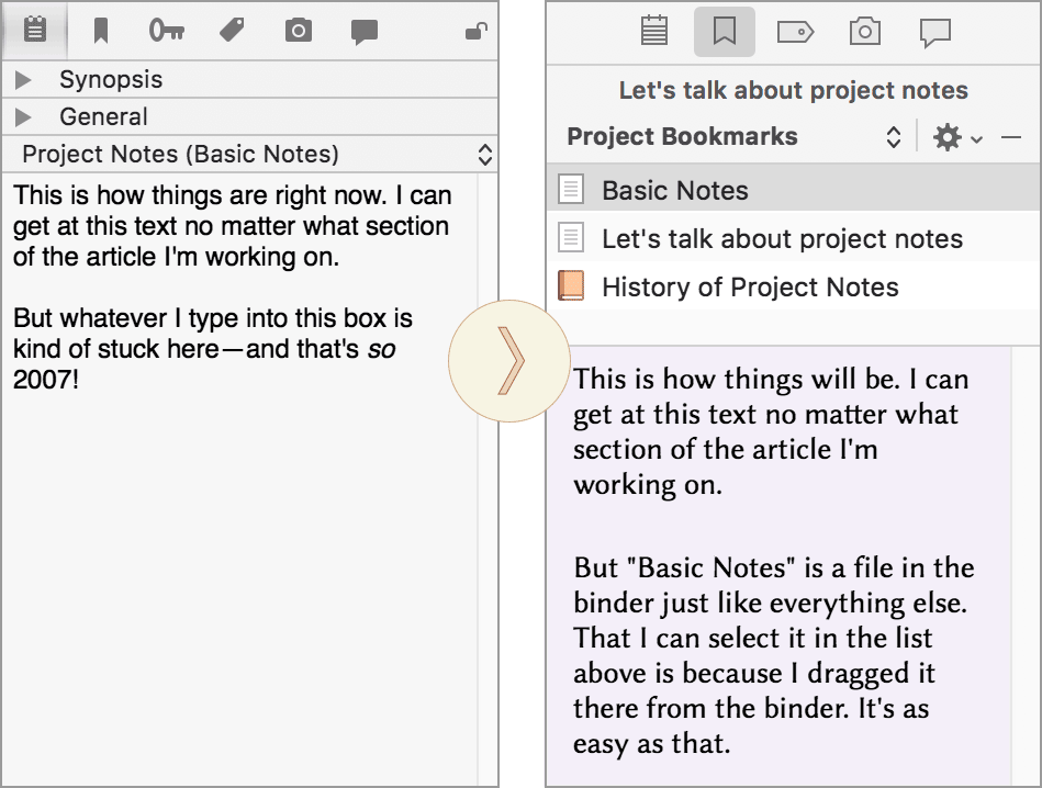
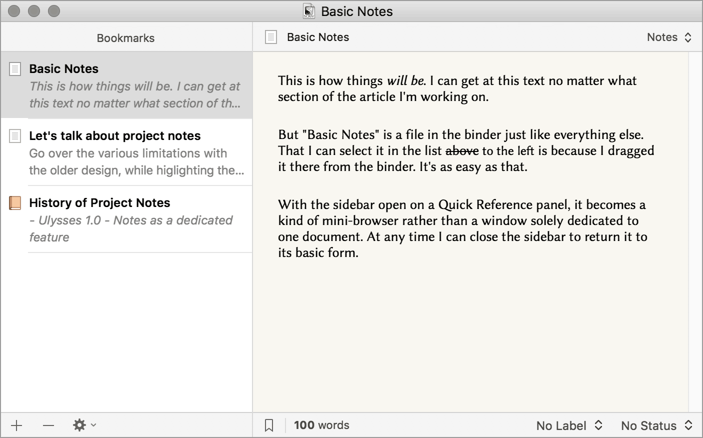
Clearly we had some problems to address, and the first reaction was to pile on a bunch of new capabilities. The solution, as it turned out, was to simplify Scrivener by merging three distinctly different but ultimately compatible features together into one new concept. To illustrate, let’s examine a before and after look at the inspector (I’ve collapsed the Synopsis and General metadata panes on the left for clarity):


14 Comments
PerlinP / 18 AUGUST 2017
Very well-thought-out ideas ! Very promising.
To me, project notes were indeed "a few little scratch notes (...) I usually forget to look at"... Being able to directly organise them into the binder is great.
Looking forward to read more about Scrivener 3.
profjsethlee / 18 AUGUST 2017
Great work! This will be very helpful. I look forward to updating.
Nicola / 19 AUGUST 2017
Great work!
Just a curiosity: what is the name of the font you used? It seemed like cochin, but slightly different
IaP / 19 AUGUST 2017
The font I'm using on the "after" side there is Biolinum, a free font made by the Libertine project (most famously used in the Wikipedia logo). I mainly use this font in the outliner and corkboard. There is font called Optima that comes with the Mac that is very close to it. They are both sans serif fonts, but with flared ends, giving them a bit of that serif feel at 12/14pt.
http://www.linuxlibertine.org/index.php?id=86&L=1
Nicola / 22 AUGUST 2017
thank you very much :)
Hashim / 29 AUGUST 2017
Amazing!
Almost everything of my wish list for the notes are mentioned in your post! Project Notes is something I use a lot for all of my projects. I can't wait to use the updated Project Notes in Scrivener 3.
The only thing I'm missing are the plans for the Document Notes. I use that as much as the Project Notes. Personally I would love to be able to see the Document Notes of the file I'm working on as well as the Document Notes of the file or folder that's one hierarchy level above that file.
Right now we can only switch between Project and Document Notes. But if I'm working on a scene, I'd love to be able to see not only the notes of that document and of the whole project, but also the notes of the chapter that scene belongs to and maybe even also the notes of the act it belongs to.
I'm looking forward to see what you've done with the Document Notes. And the Project Notes looks awesome! :)
IaP / 29 AUGUST 2017
@Hashim: Don't worry, Document Notes are going nowhere (and they haven't really changed much---it's a simple idea and probably doesn't need any embellishment at this point). That first tab on the inspector in the screenshot is where they will remain, as well as the synopsis card. I feel they will in fact be more accessible now, as they will be the sole feature on that tab rather than hosting both document and project notes---meaning whichever you used last hogs the view and you have to switch. Now when you go to that tab it will <em>always</em> be document notes.
As for inspecting other documents' stuff with the inspector while inspecting a document---that isn't something we intend to add. It is very intentionally a one to one resource. You might find employing split views to be of some use here. Also Quick Reference panels, which can load a document's notes into a split could be useful. Even learning some of the keyboard navigation shortcuts in the View/Go To and gaining a familiarity with the history function could help. Although the inspector may be limited to inspecting one thing, you can navigate around in a project very easily and always get back to where you were. As a very non-linear person who writes into very small chunks of text, I consider Scrivener's ability to cut through huge outlines and then back again to be one of its biggest innovations.
Thanks for the kind words! Hope to get this in your hands soon.
Meljean / 26 NOVEMBER 2017
I've just updated to version 3, and I like the new bookmark feature, but I'm having a hard time figuring out where my project notes went in the updated file.
In two of my projects, there is a "Notes" folder in the binder (are the project notes supposed to be converted and placed there?) But in this particular project, there isn't a Notes folder in the binder and my project notes seem to be completely missing. Any ideas?
Meljean / 26 NOVEMBER 2017
Sorry, just realized this is probably a question better posed to the forum. I'll take it there.
IaP / 26 NOVEMBER 2017
Hopefully you got some good help in the forum, but briefly I would try using Project Search to look for a phrase from the old project notes. That should dig them up from wherever they are. Standard upgrade policy is to however file project notes into a folder called "Project Notes" at the top level of the binder, and to provide an info dialogue when doing, explaining exactly where they went. So if you didn't see that, or don't see that folder, maybe the project in question didn't have any?
Verytas / 26 DECEMBER 2018
In spite of all the fog you're selling here about project notes, the fact is that they were useful and the new system completely ignores the idea. You are comparing grannies and blueberries. Bookmarks are nothing but a useless bunch of links towards the files whose place I know--as they are mostly in the Research area, hello!
What this tells me is something potentially very serious: that you have reached the spot where you are redesigning Scrivener just to have an update and grab the money from your users of v. 2. To do that, you've started destroying parts that were excellent, and introducing things that nobody asked for.
I've seen tons of wonderful software destroyed by this. Circus Ponies Notebook comes to mind.
Get a hobby.
Gabby / 12 MARCH 2021
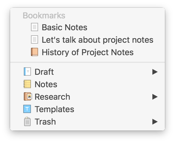
Hi, I disagree with Verytas comment strongly. I just upgraded and I love this new version of bookmarks. It's way more flexible. BUT: could you add it to your What's New section of the Tutorial? And mention there is Documents Bookmarks and Project Bookmarks dropdown? The carrots ^ are not very visible so I didn't see the option to switch at first. Anyway, I thought they'd been deleted during the upgrade and I was having a bad moment 'til I found this post.
777utash / 13 DECEMBER 2023
For over a year I have been struggling to switch from Scrivener 2 to Scrivener 3. I need time to get used to the new arrangement of elements. But what makes me finally close Scrivener 3 is the lack of general notes in the inspector.
I'm a writer, editor, and translator.
When I write books, there is information that must always be in front of me. When I translate, the same is true. Names, catchphrases, location names.
You think an editor doesn't need general notes? I wish! I write general notes for authors as I edit, and I see the information, the warnings they leave for me in the general notes section. Opening up the general notes in bookmarks is inconvenient.
Now, when writers send me a document in Scrivener 3, I ask them to send it to me in Microsoft Word. It's not as convenient, but I know for sure that neither I, nor the writer, will miss anything because of a miscommunication in layout.
I see a lot of people asking for general notes back, and I can't understand why developers persist in denying their users.
Please sign in or register to comment on this post.
Register
Sign in
Forgotten password