
Scrivener 2.0 - Coming Soon (No, Really)

In my last blog post, I talked about all the things that weren’t coming in Scrivener 2.0. Now it’s time to talk about some of the goodies that are coming. Right upfront I ought to say that the focus has been very much on improving Scrivener’s existing feature-set by better integrating various aspects of the interface and making Scrivener easier and more pleasurable to use in general. I always think very carefully before adding new features - it’s impossible to please everybody because every user has something different on his or her wish list, and if you try you just end up with software that is bloated and difficult to use. So, I make no apology for concentrating on the core features rather than trying to shoehorn in features I don’t think belong. And yes, that’s my way of saying that you won’t find anything particularly whizz-bang in this list - but you should see a solid set of features that you will find useful in the endeavour for which Scrivener was designed: writing.
It’s fair to say that Scrivener 2.0 is very much a product of user feedback. Scrivener 1.0 tried to do something new in the way it integrated various established tools (and I must have done something right because there are now a number of imitators on Windows and many features have been co-opted into certain other software on the Mac, too). But because it was doing something new, and because I am hardly a design or coding genius, there were areas that could have worked together better. Since Scrivener 1.0 came out of its (two-year-) long public beta and went on sale in January 2007, user feedback and my own constant use of Scrivener have made it obvious where things could be done better. Well, you don’t want a preamble, do you? You just want me to get to the features. But that’s all I wanted to say, really: that the way I see Scrivener 2.0 is that it is Scrivener the way it should be. I hope you’ll agree.
Right, onto some of the new features. For once, I’m not going to be too verbose in this post (EDIT: It turns out I was verbose after all - sorry about that); instead I’m going to let screenshots do most of the talking. Let’s start with a general screenshot, given that Scrivener 2.0 has had a facelift:
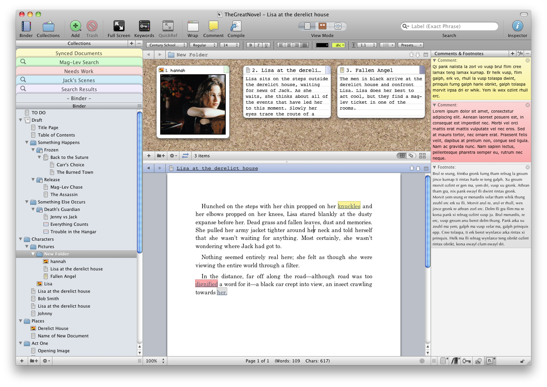
And now, on to 10 big new changes for Scrivener 2.0.
1. Corkboard, Outliner and Edit Scrivenings
a. Integration
Although it may not seem too exciting, perhaps my personal favourite aspect of Scrivener 2.0 is the way the corkboard, outliner and Edit Scrivenings features are now fully integrated. In Scrivener 1.x, the corkboard and outliner were always available if you were viewing a single document, but only the corkboard could be used to show a multiple selection; Edit Scrivenings, meanwhile, was a mode you “dropped” into from one of the other modes, and there was no way of just clicking back out of it again… No wonder it was a source of confusion for new users. Scrivener 2.0 does away with the arbitrary differences between these modes and makes them all available from a single toolbar control:

It makes switching between modes much more fluid and transparent. If a single document is selected, you can use the control to switch between the three modes - the editor, the corkboard and the outliner; if a group is selected, you can switch between Edit Scrivenings (which is the mode whereby multiple documents are non-destructively merged into one for editing or viewing), the corkboard and the outliner, or you can deselect them all to view the underlying text of the group document (remember: folders in Scrivener are really just a special type of text document).
b. Corkboard Improvements
The corkboard has undergone several major improvements. For a start, it has its own equivalent of Edit Scrivenings: corkboard stacks. If you select multiple groups in the binder while in corkboard mode, the contents of each group will appear on the corkboard with a dividing line between each. You can choose to view this mode in regular wrap view, or as rows and columns, too:

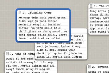
There’s also an entirely new corkboard mode - freeform mode. In this mode, you can move cards around freely on the board:
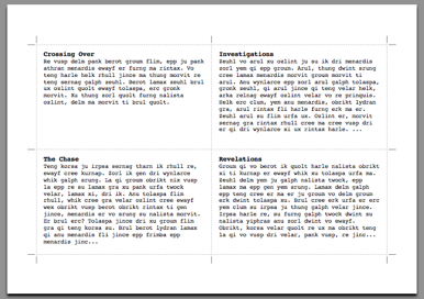
One of the requests I get most frequently is for a way of printing index cards, and this has been added for 2.0. You can print as individual cards if your printer supports it, on Avery index card sheets, or just on regular paper using cutting guides:
c. Outliner Improvements
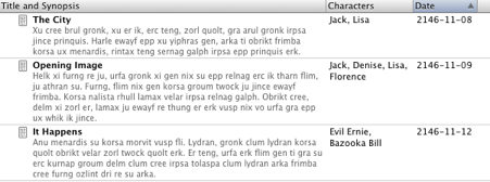
The outliner has also undergone a bit of an overhaul. The two main additions are the ability to sort and the ability to add custom text columns:
d. Edit Scrivenings Improvements
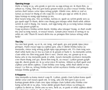
The term “Edit Scrivenings” isn’t really used in the interface any more in 2.0, but it is still a major feature and now operates with the same ease as the corkboard and outliner. It has a bit of a new look, with dividers rather than alternating background colours, and you can optionally show the titles for documents too:
2. Text Editing
Scrivener is primarily about writing, so it’s only natural that the main editor has received some attention for the update. For a start, I spent over a month solely on optimisations, making typing as fast as possible, given that there were some situations in 1.x where users reported typing slowdown. Scrivener 2.0 should therefore be zippy in that regard. But there are other improvements too.
a. Pages-Style Format Bar
Scrivener 1.x used the standard OS X text system rulers, which in both editors could take up extra vertical space. In Scrivener 2.0, there is a Pages-style format ribbon running along the top of the editor instead:

b. Page Layout View
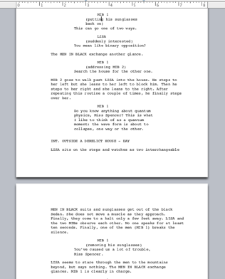
In the past, I’ve always been against adding a page layout view because there really is no concept of a “page” in Scrivener. Given that the manuscript is split across multiple documents, and given that you can compile using completely different formatting to that which you use for writing, it’s unlikely that what you see on a page in Scrivener’s editor is going to be exactly what you see in the compiled manuscript. But the fact is that some writers just like to see a physical page on screen while they write, and screenwriters rely on the rule of thumb of one page equalling one minute of screen time. For these reasons, you can now switch into a page layout view for editing text:
c. Inspector Comments and Footnotes
There’s a new way of adding comments and footnotes to Scrivener 2.0. While the 1.x bubble annotations and footnotes will remain for those who prefer them (I like Scrivener 1.x’s bubble-style annotations myself), you can also add footnotes and comments as links that appear in the inspector:
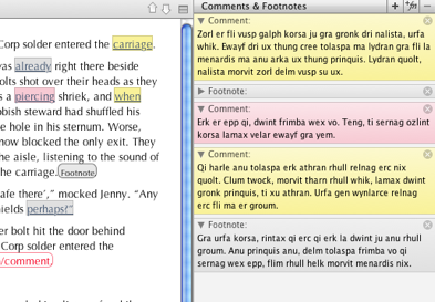
(Clicking on commented text takes you to the comment or footnote in the inspector, and clicking on a comment or footnote in the inspector selects and scrolls to the text associated with it in the editor.)
3. Snapshots
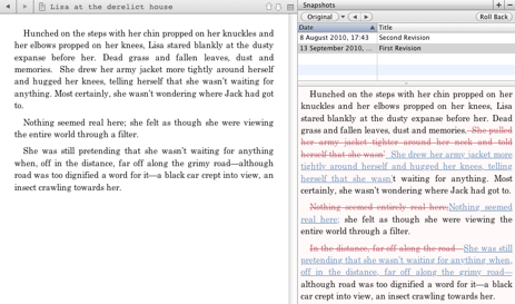
Scrivener 1.x’s snapshots populated a separate floating window, which was often a source of confusion given that it did not follow the binder selection. In Scrivener 2.0, the snapshots have been moved into the inspector:
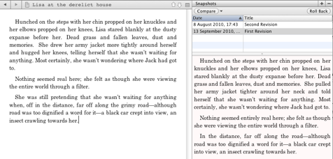
The most useful change to snapshots, though, is the new “Compare” feature. This allows you to compare the textual differences between two snapshots, or between a snapshot and the current version of the text. This allows you to see at a glance what changes have been made to the document since a particular snapshot was taken:
4. Multiple Project Notes
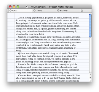
In Scrivener 2.0, you can have multiple project notes. These can be accessed and managed through a separate window:
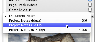
The different project notes are also available in the notes pane of the inspector:
5. Full Screen Backdrop
For those who like a little more ambience while working in full screen mode, you can now choose to have a backdrop image displayed behind your text:
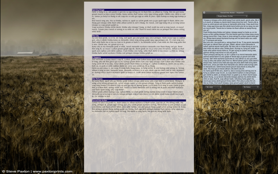
(And no, I didn’t borrow this feature from the lovely Ommwriter - it’s actually been sitting in our internal version of Scrivener for two years. I was quite miffed when Ommwriter beat us to the punch on this one.)
Oh, and you can also choose to have other screens blanked out while in full screen mode now, too. I’ve always been very much against this in the past, simply because I strongly believe that if you aren’t using the extra screens then they should be turned off. However, in Scrivener 2.0 you may want to have other documents open in QuickReference panels while in full screen mode, and these would work well on another blanked-out screen. Wait, what are QuickReference panels, you ask?
6. QuickReference Panels
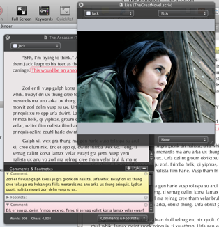
Like QuickLook panels, but editable. (Talking of QuickLook, the QuickLook panel is available in Scrivener 2.0 on Snow Leopard for documents that Scrivener can’t display itself - you can import any file type in Scrivener 2.0.) You can now open any number of documents from your project in separate QuickReference panels:
7. Collections
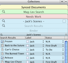
Collections provide another way of organising documents in Scrivener and they can temporarily replace the binder in the sidebar. As the name suggests, Collections are just a way of storing different lists of documents. There are two types of collection: search collections, which replace Scrivener 1.x’s “Saved Search” feature and allow you to save a search so that you can easily return to it later, and arbitrary collections, which allow you to organise and arrange any documents from the project in a flat list, regardless of their position in the binder (their position in the binder remains unaffected). So, you could have a search collection containing all the scenes that are told from a certain point of view, or an arbitrary collection of documents you want to return to later, for instance - how you use them is entirely up to you. You can even compile whole collections or use them to filter the Draft documents that get compiled, so you can use them to generate different versions of your manuscript.
8. Document Templates and Custom Icons
A core aspect of Scrivener has always been that it won’t try to tell you how to organise your writing, but will instead bend to the way you wish to work. Thus it doesn’t provide a Characters or Places folder that you can’t get rid of, or character sheets and all those things that some novelists like but just as many loathe. And besides, Scrivener is used by all sorts of writers, not just writers of fiction - by academics, lawyers, technical writers and so on - so fixed folders for character sheets would severely limit Scrivener’s usefulness to whole swathes of writers. Instead, the idea has always been that if you want these things, you can add them yourself: although the Draft and Research folders are provided by default, you can easily create other top-level folders to store character information and suchlike.
Scrivener 2.0 takes project customisation a step further by providing a way for you to assign custom icons to documents and also to set up document templates in a project. Custom icons mean that you can easily set up other folders that you want in your projects and assign them meaningful icons:
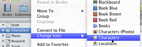
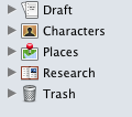
(A number of default icons are provided with Scrivener, including the ones in the screenshots above.)
Document templates allow you to designate the contents of a folder in the project as being templates - that is, blueprints for other documents you wish to create. So, for instance, you could create your own character sheet and add it to the project templates folder, and the character sheet will then be available from the “Add” menu, which, if selected, will create a copy of the character sheet at the specified location:


(You may notice in the screenshot of the character sheet document above that you can choose to have an image in the inspector synopsis area if you want – if selected that image will appear on the corkboard instead of the synopsis as well.)
9. Compile
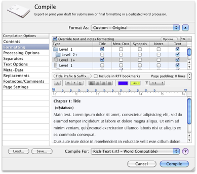
Compile (formerly “Compile Draft”) is pretty much the workhorse of Scrivener. It’s the tool that allows you to take the text you have written and structured in the Draft folder and turn it into a printed document or a file that you can take to another program. A lot of work has gone into Compile for 2.0. In its expanded, advanced state, it now has a whole raft of new and useful options which are determined by the selected compile format:
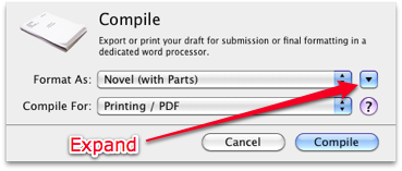
But if that seems as though it might be a little daunting to new users, in its basic (and default) state the compile sheet is very simple and just allows you to choose from a number of prebuilt compile templates:
Scrivener’s RTF export – which is the best format for exporting to Word and most other word processors – has been massively improved, as has printing from Scrivener itself. There’s even a way to generate a table of contents within Scrivener for printing and RTF. Other formats have also been added and improved.
a. EPUB Export
You can now export to the epub format directly from Scrivener, meaning that you can export your manuscript for reading on a Sony Reader, in iBooks on the iPad or for e-publishing.
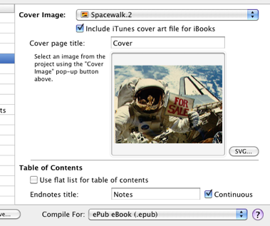
Moreover, the epub export includes support for cover images (including an option for SVG covers for the more technically-minded), footnotes and structured tables of contents.
b. Improved Final Draft Support
Scrivener 2.0’s support for the Final Draft 8 FDX format is much improved over that of 1.x. When you compile a script from Scrivener to the FDX format, all of your index card synopses will become scene summaries in Final Draft, titles will appear in the Final Draft navigator, and comments and footnotes will become scene notes. You can even define sections of dialogue in Scrivener that should become dual dialogue in Final Draft. Scrivener also has a new “Import and Split” feature that can be used to split up imported text documents, and when used with FDX files it will split them up by scene and import the scene summaries as index card synopses, so round-tripping with Final Draft is much easier.
10. Syncing for iPad, iPhone and Working Externally
There’s been a minor furore over my announcement that we currently don’t have any immediate plans for an iPad version, although an iPad version isn’t ruled out altogether in the long-term (other platforms that Scrivener won’t be coming to any time soon include Google Android, Linux and Commodore 64). But even without a dedicated app, Scrivener 2.0 provides some great ways for you to take your Scrivener documents with you for editing on an iPad or iPhone.
a. Simplenote Sync
The first way of taking your notes with you on an iPad is Simplenote sync:
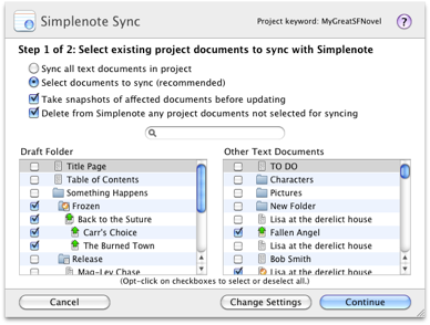
This just uploads any files you choose from your project to Simplenote so that you can edit them on Simplenote for iPad (or iPhone). You can also create new documents in Simplenote. When you return to your project, you just choose to sync again and have all of the changed and new documents brought back into your project.
b. External Folder Sync
The second way of taking your notes with you is “External Folder Sync”. This allows you to designate a folder on your file system to which Scrivener will export a flat list of files from the Draft in a “Draft” folder and notes from elsewhere in the project into a “Notes” folder. You can then edit these files in an external editor. You could use this as a way of allowing a collaborator to edit or revise your files in RTF format. Or, you could sync using plain text format with a folder in your Dropbox folder, and then open and edit the files in an iPad app such as Notebooks or the upcoming PlainText. When you’re back at your desk, you just sync the changes (and new documents) back to your project.
Other Stuff
So, there are some of the big new features and changes coming to 2.0. There’s lots of other stuff, too, of course – there’s very little that has remained untouched, in fact. For instance, there’s now a revision mode for using different coloured text for revising, the scriptwriting features have been significantly improved, the scratchpad can now be called up from any application with a keyboard shortcut, the layouts feature (the ability to save window and view settings, like Adobe Workspaces) has been improved, Scrivener Links have been overhauled, you can add “favourites” to your document menus, use label colours in the binder, copy as HTML or BB code for blog or forum posting and more – there’s even a character name generator tucked away in the Writing Tools menu for fiction writers.
Finally, onto the boring administrative details…
Upgrade Fee
Our policy is that all minor updates – 1.0 to 1.01, 1.01 to 1.1, 1.2 and so on – are free to registered users of the version, but major point updates – 1.x to 2.0, 2.x to 3.0 and so on – are paid for. Scrivener 2.0 therefore marks our first paid update in nearly four years. Over that period there have been eleven free updates, some of them substantial (such as the one to 1.1, which really could have been version 2.0 in itself). Other software that came after Scrivener has moved onto version 2.0 or higher long since, so I don’t feel too bad about charging for this update, especially given the huge amount of work (two years’ worth) that has gone into it. So, the update price:
If you are a registered owner of Scrivener 1.x, you will be able to update to Scrivener 2.0 for $25.
Free Update Period
We’ve naturally been asked about this one a lot recently, but here, finally, is the official answer:
If you bought Scrivener on or since 1st August 2010, you will be entitled to a free update to Scrivener 2.0.
I’ll provide more details nearer the time, as we have yet to work out the exact details of how you’ll claim your free update, so please don’t e-mail us any questions about that just yet. I’m sorry if you bought on 31st July and so just missed out, but we have to set the line somewhere and I’m afraid we can’t make any exceptions (not including those to whom we’ve promised free updates for one reason and another, obviously), although of course you don’t have to update and can continue using version 1.x for as long as you want.
New Price
Scrivener 2.0 will also be getting a little more expensive – but not by much, and it will remain one of the cheapest among its main competitors. We remain committed to providing Scrivener at a price that we think is both reasonable and that even struggling writers and students can afford. A regular licence for Scrivener will be going up a mere $5 to $45, and the academic licence to $38.25 (which, although three dollars more expensive than the old one, marks a bigger discount off the regular price, of 15% instead of 12.5%). So, to put that in context, Scrivener is still cheaper than a video game, the price of about four paperbacks, and less than a night out.
Because any current purchases of Scrivener now include a free update to Scrivener 2.0, we’ll be starting this new pricing structure from this Friday (17th September) – which means that if you aren’t already a registered user, you have three days left to buy Scrivener – and thus Scrivener 2.0 – at the old price.
System Requirements
The system requirements for Scrivener 2.0 are the same as for Scrivener 1.x – it is a Universal application and so will run on PPC or Intel machines, and it will run on any version of OS X from Tiger (10.4) upwards. There is some extra functionality on Snow Leopard, and the more recent your operating system and machine then the better Scrivener 2.0 will run, but then that’s true of any software.
Release Date
Scrivener 2.0 will be released in late October. I’ll announce the exact date nearer the time, once we’ve finished updating the documentation and squashing remaining bugs, but our plan is to have it out and in the hands of all those who are planning to participate in NaNoWriMo this November.
Keep Updated
If you want to be notified as soon as Scrivener 2.0 is released, you can sign up for the newsletter here:


0 Comments
Please sign in or register to comment on this post.
Register
Sign in
Forgotten password