Note: This blog post pertains to upcoming features in Scrivener 3, which will be released on macOS later this year and will follow on Windows during early 2021.
Ever since Scrivener 1, you have been able to split Scrivener’s editor in two and view two documents alongside one another. In Scrivener 2 we added a new feature which is often missed: the ability to have one editor control the other. So, if you have the corkboard in the left editor, for instance, you can click on the “Automatically open selection in other editor” button in the footer bar (the button showing an box icon with an arrow pointing out of it). With this turned on, selecting a card in the corkboard (or a row in the outliner) causes the document associated with that card (or row) to be opened in the other editor. This added more flexibility to how you could use the two editors.
Ioa recently wrote a blog post on the new bookmarks feature in Scrivener 3. This provides an additional way of referring to documents and research in your projects, because you can now view bookmarked documents right in the inspector. There’s another place you can open documents, too: in Copyholders.
Copyholders
The ability to split Scrivener’s editor in two is very useful. But why only split it two ways? What if you want to refer to more than two documents at a time (or more than three if you’re using Bookmarks)? One problem is the relationship between the two editors: “Automatically open selection in other editor” makes sense if there is one other editor, but no sense if there are several. Likewise, by default, clicking on an internal link causes it to be opened in the other editor—if there were several other editors, you’d have no idea where it would be opened. For Scrivener 3 we wanted to make it possible to split the editor more ways, but without causing the confusion that would ensue with multiple full editors. The solution we came up with we call “Copyholders”.
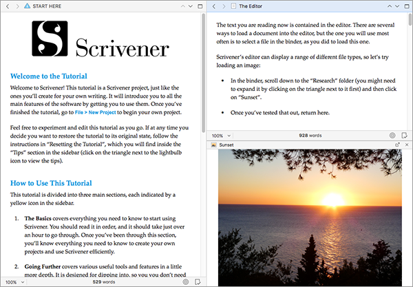
In the real world, a “copyholder” is a small stand to which you can clip documents in order to refer to them as you write or type—and that’s exactly what Copyholders are in Scrivener, too. In Scrivener 3, both editors now have a Copyholder available. A Copyholder is essentially a subsidiary editor that appears inside the existing editor and which can only show single documents (so it doesn’t support corkboard, outliner or Scrivenings modes). Other than this limitation, copyholders are full editors in their own right, allowing you to view and edit text or look at research files.
To open a Copyholder, you simply drag a document from the binder and drop it onto the editor’s header bar holding down the Option key. (You can also use the Navigate > Open menu, but dragging is fastest.) Below you can see a Copyholder has been opened in the right editor, showing an image of a sunset:


10 Comments
Mathew / 06 OCTOBER 2017
Wow! Very sweet. These additions will be quite helpful.
Let's release this thing soon! I'm itching to use the new features in a big project I'm working on.
Jonas Lismont / 06 OCTOBER 2017
I'm a basic user of the split editor, but this is very useful for translations. Thanks
razyr / 06 OCTOBER 2017
OK, at this point you are just showing off. :-)
Loving the new features. How about a link for preordering S3?
Joseph / 06 OCTOBER 2017
In the layouts menu, I only see the presets that will come loaded with the program, but I don't see the ability to create/save a custom layout. Will users be able to create custom layouts in 3.0?
KB / 06 OCTOBER 2017
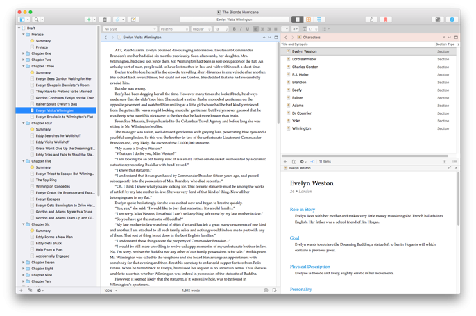
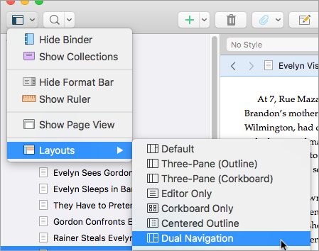
@Joseph: Yes, you'll be able to create custom layouts in 3.0 just as you could in 2.x, through the Windows menu. The menu shown is just a quick way of accessing layouts that have already been defined via the toolbar.
@razyr: Hopefully it won't be too long before proper orders are up!
Eric Beaty / 07 OCTOBER 2017
@rayzr: Awesome suggestion
@Joseph: I was wondering the same thing. Thanks for asking.
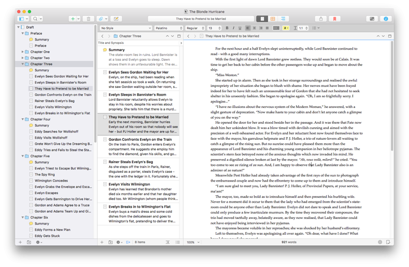
Dual Navigation UI: Sweeeeeeeet!
MikeGardiner / 08 OCTOBER 2017
Speaking of pre-orders, any consideration given to a Scrivener 3 pre-order, allowing the purchaser to immediately download and use version 2 in the interim? I want to buy and use Scrivener now, but since 3 is a paid upgrade I can't justify buying 2 right now only to pay to upgrade to 3 in the next few months.
Edhead / 09 OCTOBER 2017
@MikeGardiner
No, you can't preorder, but if you buy Scriv 2 for Mac now you will get a free upgrade. Keith's comment in the forum confirms it:
"Essentially, if you buy now, you'll get a free update to Scrivener 3 for Mac when it comes, because we always give free updates to anyone who has purchased within the three months prior to release, and we are definitely less than three months away from the Mac 3.0 release. But the Windows version will be much longer, so right now you <em>aren't</em> in the free three-month upgrade window, so if you buy the Windows version now, you'll need to pay a $25 upgrade fee when Windows 3 is released. There might be a better deal <em>after</em> Mac 3.0 is released, but we haven't announced anything official about that yet..."
MikeGardiner / 10 OCTOBER 2017
Thanks @Edhead, just purchased. Bring on 3.0!
Ray Ishido / 18 OCTOBER 2017
Hi!
Will it be possible to open an internet navigator window inside scrivener?
Please sign in or register to comment on this post.
Register
Sign in
Forgotten password