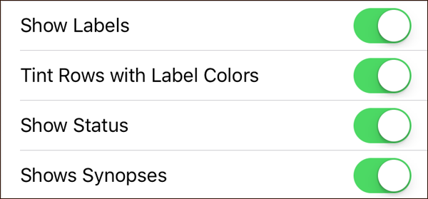
As already expounded in the previous post about expanding outlines, Scrivener’s "binder" (its sidebar) is essentially an outliner. If you tap the gear icon in the footer of the sidebar, you’ll open ‘Project Settings’. Within binder options, you can turn on ‘Show Labels’, ‘Tint Rows with Label Colors’, ‘Show Status’ and ‘Shows Synopses’. With all those binder options engaged, things are about to get more colourful and informative.
Scrivener iOS: Outliner

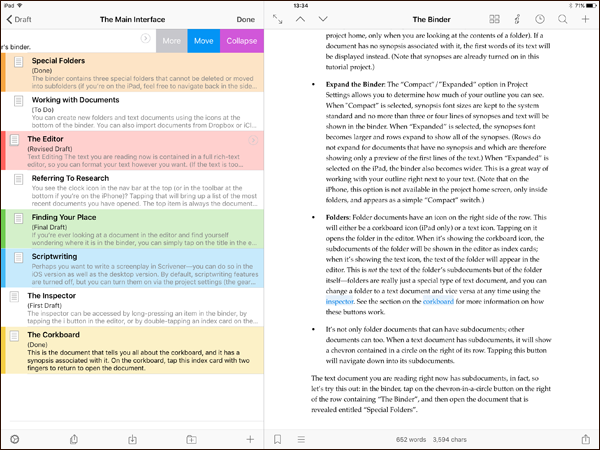
Tapping on a document in the binder will open it in the editor. If you tap and hold on a document, the inspector opens. This allows you to edit the title and synopsis of the associated document, add notes, and assign a label or status. If you have ‘Tint Rows with Label Colors’ selected, your binder document row will take on the label colour you assign. Giving your document a ‘Revised Draft’ status will also be reflected in the binder if you have ‘Show Status’ selected. How much information you want the binder to show is entirely up to you.
Back within ‘Project Settings’ (tapping the gear icon again), you have ‘Compact’ and ‘Expanded’ as a sidebar choice. Your selection will determine how much of your binder outline you can see. With ‘Compact’ selected, no more than three or four lines of synopses text will be shown in the binder. When ‘Expanded’ is selected, the synopses font becomes larger and rows expand to show all of the synopses. If a binder document has no synopsis associated with it, the first words of its text will be displayed instead. (This synopsis behaviour will be be coming to both our macOS and Windows versions in the future.) On the iPad, choosing ‘Expanded’ will also make the sidebar wider, so that it takes up nearly half of the screen.
As detailed in the earlier referenced blog post, swiping left on a row with subdocuments will reveal an ‘Expand’ button. Pressing the button will reveal the subdocuments indented below their parent, allowing you to see as much (or as little) of your outline as you want.
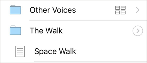
Any folder in your outline will have a chevron next to it. Tapping on a folder will normally drill down a level to reveal its subdocuments. If the folder has been expanded, however, its subdocuments are already visible, so tapping on the row will simply open the folder's contents in the editor or corkboard. (If you still want to drill down to view only the subdocuments, you can do so by tapping on the chevron, which will now be enclosed in a circle to indicate that you need to specifically tap the chevron to drill down.)

A collapsed folder and an expanded folder.
If you now press on ‘Edit’ within the binder nav bar, you enter editing mode. In this mode, you can drag and drop to rearrange binder documents by pressing and holding the drag indicator on the right of a row. The icons in the binder footer also change in editing mode, allowing you to move documents to a different folder in your project, duplicate documents, merge documents and move them to the Trash. There’s also a “move mode” button (a cross with arrows) that changes the icons in the footer toolbar to buttons that allow you to move selected documents up and down, and to indent and dedent them in the outline.
On the iPad, you can even edit your outline whilst referring to a document in the editor.

The outliner on Scrivener for iOS.
Whether you're on an iPad or iPhone, though, Scrivener's binder is a powerful and fully-featured outliner that gives you complete control over the structure of your writing and research.

