For our second post on the upcoming Scrivener 3, I'm excited this week to show off a new corkboard layout that takes advantage of one of my favourite features in Scrivener: coloured labels. Labels have always been helpful for organizing your project—you might use them to mark a scene's viewpoint character, to indicate a document's main topic, or to track locations for a script. In Scrivener 3, you can further use labels to visually chart your project's structure by the points important to you.
Structuring with Label View

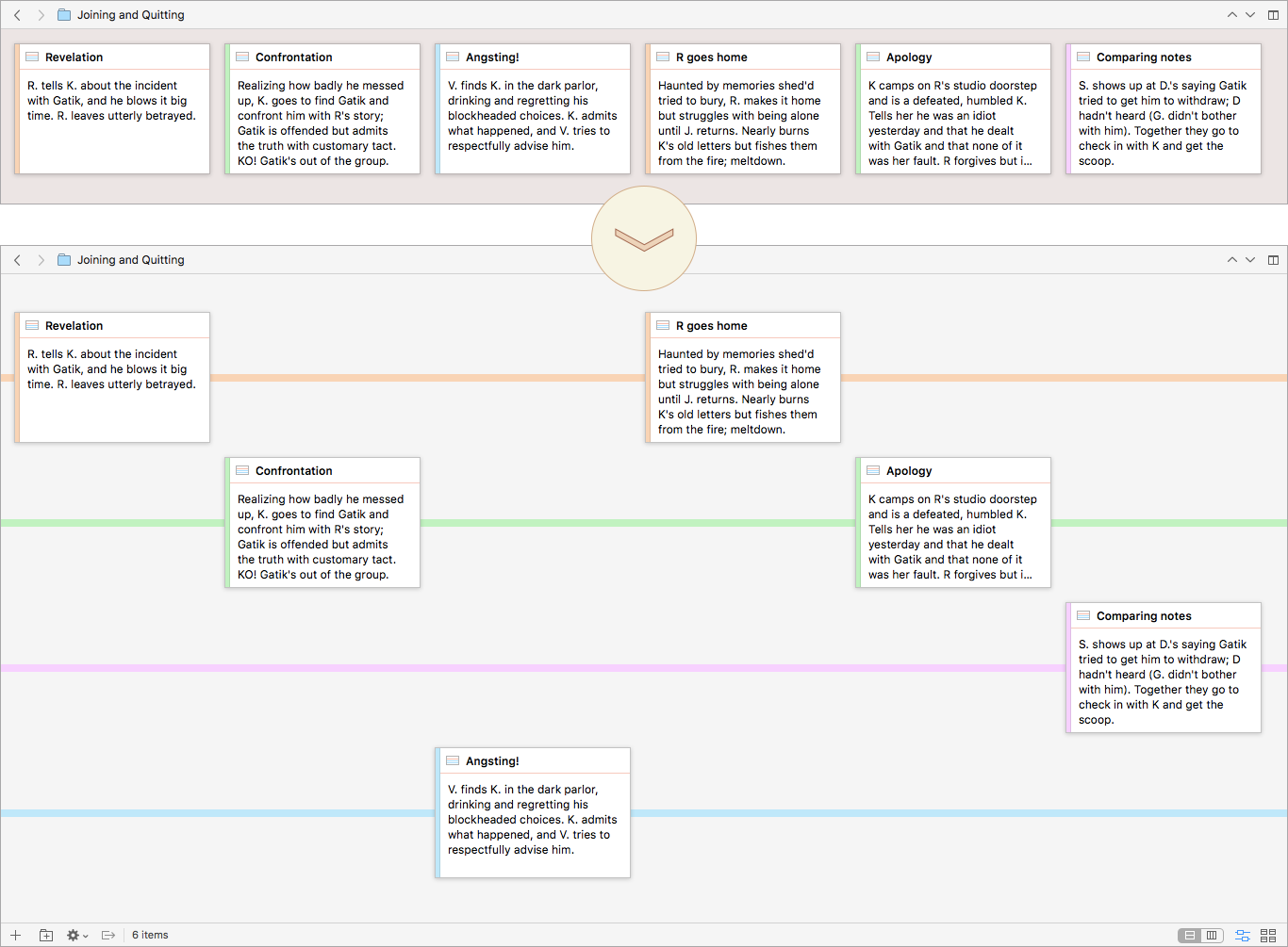
Arranging by label keeps the linear order but breaks out the documents into distinct threads.
Use labels to monitor the tension level of your scenes? View ▸ Corkboard Options ▸ Arrange by Label will quickly give you an overview of the pacing. For a story with multiple narrators, creating a label for each viewpoint character will let you see at a glance whether any character goes too long without a scene or has too many too close together.

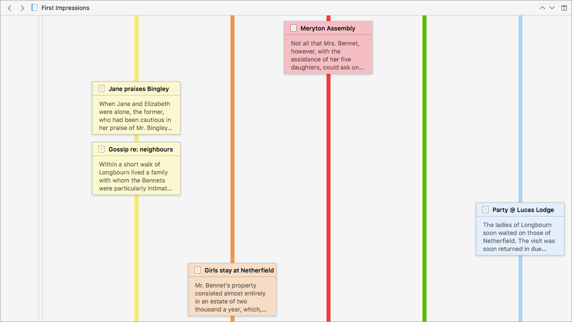
Cards can be displayed horizontally or vertically along the label lines.
Just as on the regular corkboard, you can rearrange cards by drag and drop. Moving cards between label lines will update the card's label without changing its order in the narrative. And of course you can create new cards and edit them, all as you're used to doing, making the label view great for both initial planning and later reorganizing.


13 Comments
Wess Mongo Jolley / 23 AUGUST 2017
Is this a Mac only feature? I don't see this option in my Scrivener on Windows.
PerlinP / 23 AUGUST 2017
I made use of such a nice feature using a software called Power Structure years ago. It was very useful. Great to have it in Scrivener 3 !
Nice to have regular news about Scrivener 3 :-)
Could we have a hint about the upcoming topic ?
@ Wess : that's a future feature for Scrivener 3 (Mac &Windows).
Jeremyd / 23 AUGUST 2017
Can two cards occupy the same "moment" on a timeline but be on different label lines? So in a horizontal timeline, they would be in the same vertical space but on different label lines.
This is an AMAZING feature that I cannot wait to utilize.
Thanks!
-Jeremy
elgarak / 23 AUGUST 2017
Shut Up and Take My Money!
Ahem... quieting down. Really, this is a very cool feature that I can't wait to use in the next version.
Steve Nickell / 24 AUGUST 2017
I just spent $20 in apps trying to achieve this very thing. Now you tell me? Dude... Can this release now, please? I really need this feature.
JH / 24 AUGUST 2017
Thanks, everyone, for the enthusiastic feedback! :)
Wess - Whoops, sorry for the confusion! I tweaked the post to make it clearer that, as PerlinP said, this is a new feature coming in Scrivener 3. It will be in both the Mac and Windows versions.
PerlinP - I hadn't heard of Power Structure, but I know some other software has similar sort of views; we've had interesting forum discussions over the years, considering how users work with this type of layout and how it could fit into Scrivener's design. The way it ended up integrates quite neatly, in my opinion. And I'm such a sucker for anything that uses colours to organize. ;)
As far as hints to the next post's topic...ah, it's a surprise?
Jeremy - There can only ever be a single card in any vertical slot, and there's never a gap between slots. Rather than a timeline, think of it as the linear structure of your manuscript: each card represents a scene (or paragraph or argument or whatever it may be--but a real piece of writing), and they are laid out in the order the reader experiences them. It's text chronology, if you will, rather than story chronology--you never have two paragraphs occupying the same place in the manuscript, even if they both describe the same moment in story time. Scrivener always compiles a linear document, following the order the items are arranged in the binder, and the label view shows that order.
To me this makes it valuable as a structural tool, since you're looking at the flow of the text the way the reader will see it; thus, in the POV example, it's a snap to see when a character's voice has been neglected too long or is weighted too heavily at the beginning or end, etc. Labels have always worked this way in Scrivener, one per document. The new layout pops that data out in a really clear visual.
elgarak, Steve - Glad you're looking forward to it! It will be coming soon... :)
Ikemitsu / 24 AUGUST 2017
It's not possible to assign several different labels for each document, no?
Mathew / 24 AUGUST 2017
Wow, this is an amazing new addition. There are several different ways that I'll use this feature. Many thanks for adding!
PerlinP / 24 AUGUST 2017
On the back of what Ikemitsu asked above :
(Sorry for my bad english.)
If one considers a document in the binder as a block of text (paragraph, scene, argument...), it'd be great that this document could bring together several index cards in the corkboard and, thus, several lines in the outline, as one text generally mix several "notions" that that one would like to visualize on distinct threads in the corkboard or on distinct lines in the outline.
For example, in a thriller novel, one single scene can push forward the love subplot, show a clue and end another subplot. Three distinct labels.
Likewise, in a research paper about say archaeology, one document might talk about a specific excavation site, an artefact category and a research theme one would like to see on distinct threads with distinct labels. Likewise in the outline.
It also works the other way. Say I write that thriller novel. At one point, I want to push forward a love subplot, show a clue and end another subplot. I can try to gather them into one scene making them simultaneous, then try to separate them in time putting them into two or three separate scenes. It'd be nice to be able to view those possible gatherings in the curkboard and the outline.
Several 'notions' that one might want to view might occur at the same time, in the same block of text.
See what I mean ?
I don't think Scrivener 3 will work that way, right ? Could it be a conceivable future feature ?
JH / 24 AUGUST 2017
Ikemitsu and PerlinP - Scrivener is built on the concept that each document is represented by a single index card and vice versa; having multiple cards for the same item isn't feasible within that central design. However, you can get a similar sort of view using custom metadata, of which you can assign any number to an item. That's true of keywords also, but using separate custom metadata fields and the outliner view will give you a consistent vertical plot similar to the corkboard label view. (You can see an example at http://literatureandlatte.com/blog_images/scr3-label-view/CustomMetadataThreads.png - unfortunately we're currently not able to include images or links in the comments.)
All I did for that is create separate custom metadata fields, assign each a different text colour, then use a block character to mark the field for each item. That's doable already in the current version of Scrivener, so you may want to check it out and see how it suits you!
PerlinP / 24 AUGUST 2017
@JH : thanks for the tip and the quick and detailed reply. I'll check it out :-)
Ikemitsu / 25 AUGUST 2017
Thank you @JH for the tip! I've been using keywords mostly but this meta-data approach is definitely nicer.
lmwoodward / 01 OCTOBER 2018
I love this feature but I'm having trouble making it work for me.
I've arranged my manuscript so it's Part (folder) > Chapter (folder) > Scene (document). I've labelled by scenes by character perspective, but as one chapter might have multiple scenes from different perspectives and I can't multi-label, there doesn't seem to be a way for me to use this feature to manage my whole manuscript. I can only open one folder at a time in corkboard, which doesn't give me much information.
Is there a way that by opening a Part in corkboard, it could also reveal the scenes within chapters?
Please let me know if there's a way around this, Otherwise it would be a great feature for an update :)
(running Windows beta)
Please sign in or register to comment on this post.
Register
Sign in
Forgotten password