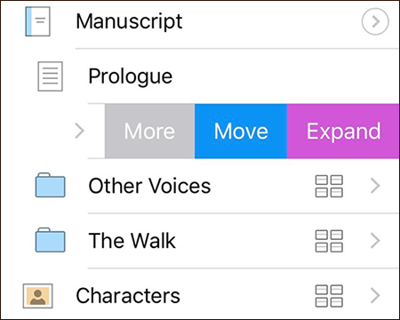
Scrivener’s binder is essentially an outline: one of the key features of Scrivener is that you can use any structure you want when working out how your writing pieces together. Scenes inside chapters inside parts; character sketches inside a notes folder; photographs inside a pictures folder; research notes nested away for the future—however you want to structure your work, Scrivener gives you the freedom to do so.
Using the outliner, it’s also possible to work on discrete parts of the outline in isolation—with the outline of only a single chapter, say. But how to bring these key features to iOS, where structured outlines haven’t traditionally been part of the UI lingua franca?
On iOS, the convention is to drill down through multiple levels of an outline, viewing each level in a separate list, and following this convention means that you can drill down through Scrivener’s binder to work with different parts of the outline just as you can on the Mac or Windows. Tap the Draft folder, and its contents slide into view; tap a chapter folder inside the Draft folder, and its contents slide into view—and so on.
Having to drill down through every level and never being able to see multiple levels of your outline at once could get fairly tiresome, however—which is why Scrivener for iOS supports a full, structured outline.


